For many academics publishing papers is a primary goal. To be successful the information in a paper must be presented in a specific way. The language is often formal and usually uses very precise technical terminology particular to the subject area. Diagrams, if any, are likely to be line drawings and data or infographics are represented in the form of tables and graphs.
Academic papers are not expected to be accessible to non-specialists and therefore can be particularly difficult to understand for people who do not work in academia. But often it is exactly those people, whether they are members of the public, potential research beneficiaries or partners, policymakers, funders or even potential students and their parents, that need to know about the research, its implications, and its impacts.
Non-academic audiences all require the same thing: research findings presented as a story, in an engaging and understandable way.
Clarity from complexity
At Bulletin Academic we take the time to understand complex stories and craft a narrative arc that communicates them clearly and engagingly to all audiences. But even the best story can be overwhelming when it is displayed as one long block of text. They say a picture paints a thousand words and when you have complex information to communicate, an image or infographic can deliver even more than that.
Images can set the tone (an engaging image will draw people in and encourage them to find out more) and they can communicate specific information (providing context to the written content). They can also help the flow of the document by breaking up the text in a visually appealing way.
Infographics present information in an efficient and clear way for the viewer. They can take many forms from simple icons and charts to more complex concepts with illustrations. Infographics are one of the most effective methods to communicate complex information in an easily accessible way. In a world of shrinking attention spans they also make it much more likely that readers retain the information and share it with others.
Things to consider when creating an infographic
Story
What is the key message you want the reader to understand and retain from the information presented in the infographic? Understanding your target audience will shape the tone, language and style of your infographic.
Structure
Once you know your story and target audience it is important to structure your infographic to make it as readable as possible. Understanding the hierarchy (how it will be read and digested) and limiting text (keeping it easy to read and to the point) are important considerations.
Delivery
The readability of an infographic can be easily overlooked but it is essential to ensure the greatest impact. Creating consistent spacing and alignments of the elements, keeping icons as simple and recognisable as possible, ensuring the text is legible and using graphics and colours that provide visual cues are key to generating engagement with the content.
Types of infographic
The creation of an infographic, and knowing when and how to deploy them, can be overwhelming. Bulletin has created a wide range of infographics for both academic and non-academic clients. We have found there are four types.
Statistical
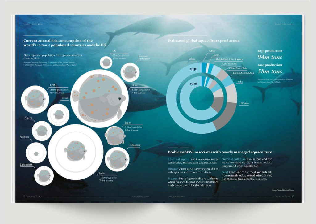
Charts and graphs are perfect for statistical data. Combining them in an engaging way can help highlight the significance of a certain figure or trend and take the reader on a journey. The choice of the scale and chart type changes the interpretation the viewer takes from the data and is a key area where we can help ensure the desired story is told.

Technical subject or concept
Infographics can help make a complex subject matter more approachable, often shedding unexpected light on a subject that the viewer had no prior knowledge of.

Comparisons
Displaying contrasting data is sometimes the best way to convey your message. It is very important to represent graphics in a clear way to communicate the data at a glance.

Processes
Visuals can help explain the detail of processes and timelines to any audience. Considered use of hierarchy can make this information compelling.

The Bulletin team includes a statistician, a designer and writers who are experts in communicating the complex ideas and data generated by university researchers. This experience makes us an ideal partner for researchers and academics who know that their findings and the impacts they have generated are worthy of a wider audience. We can help repackage them into a document that is accessible.
If you would like to know more about our services, please contact Dr. Chris Bridges on chris.bridges@bulletin.co.uk.


